A cult status brand for a Reformer Pilates Studio that’s breaking the status quo.
“We’re clear about who we are, and we’re not going to be like the other reformer studios.” Way to throw down the gauntlet to your brand designer!
The challenge for this Reformer Pilates brand was balancing appeal to a wider audience whilst delivering a very clear message about who they are and what they stand for.
Sam and Sarah are sisters who are obsessed with Reformer Pilates. Sam and I knew each other back in my corporate days and I jumped at the chance to work with them when Sam asked me.
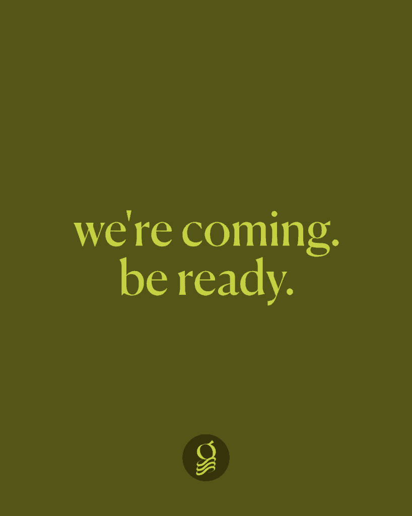
everyone wants to be special, nobody wants to be different
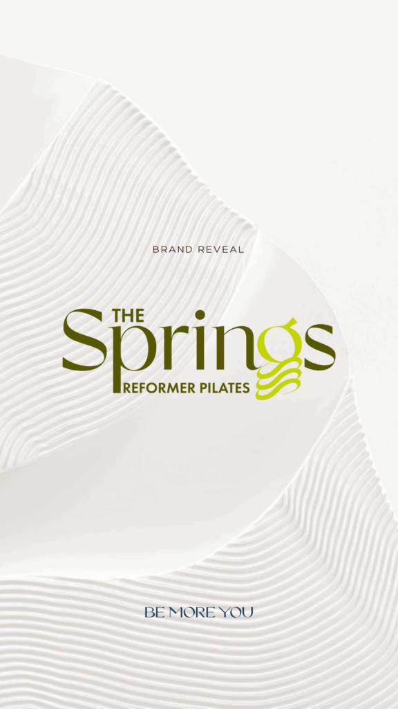
Brand Naming: The Springs
The Springs Studio is a reformer pilates Studio in Southampton, on the edge of the New Forest. They are is launching within Bodyworx, an established medical performance clinic offering chiropractic, osteopathy, acupuncture, podiatry services and more. The studio is entirely separate, but there will likely be a crossover with client referrals.
The challenge was to choose a name that would equally appeal to a wide age range and demographic.
The Springs was born. Its simplicity means it will be easy to remember, and the reference to springs serves as a reminder that this is a dynamic reformer class, separating it from mat-based pilates.
Brand Strategy: The Springs
The brand strategy focused on how The Springs could become a meaningful brand that stood out amongst the generic reformer classes that were available in the area.
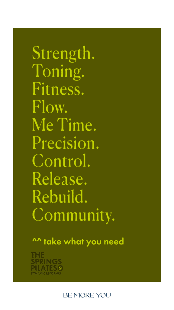
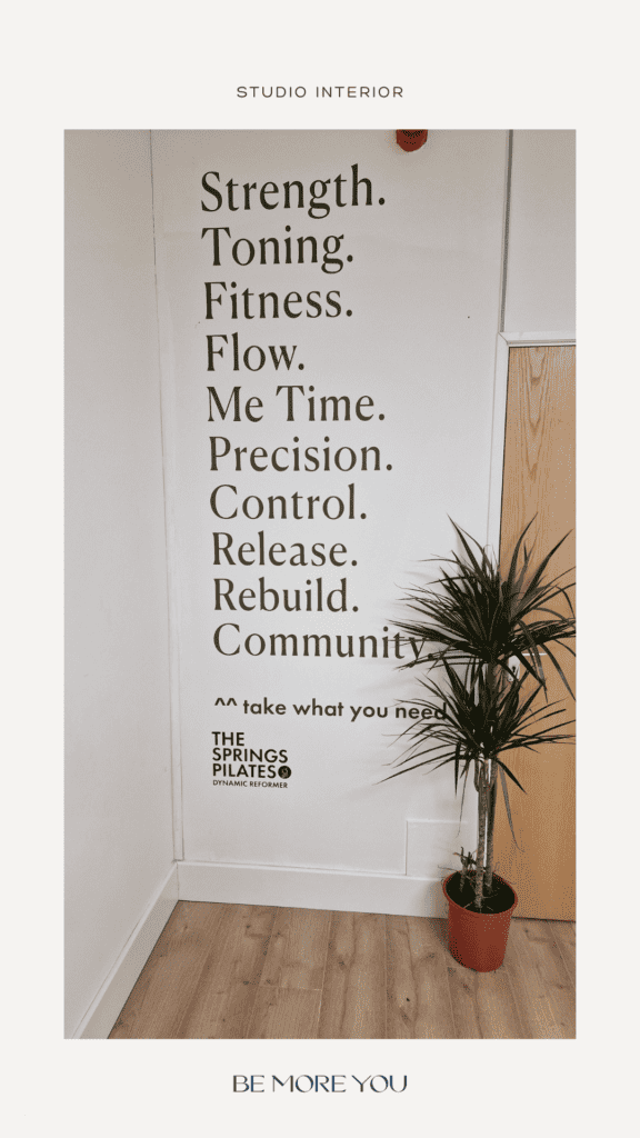
A throwaway comment during our meeting became the foundation of the brand philosophy that Reformer Pilates is for everybody and that everybody can get something different from the class, be it Strength training, toning, fitness, recovery or simply a fun way to spend time with friends.
This philosophy also serves as the foundation for content creation, with the brand pillars focussed around each of the areas of: Strength, toning, fitness, flow, me time, precision, control, release, rebuild and community.
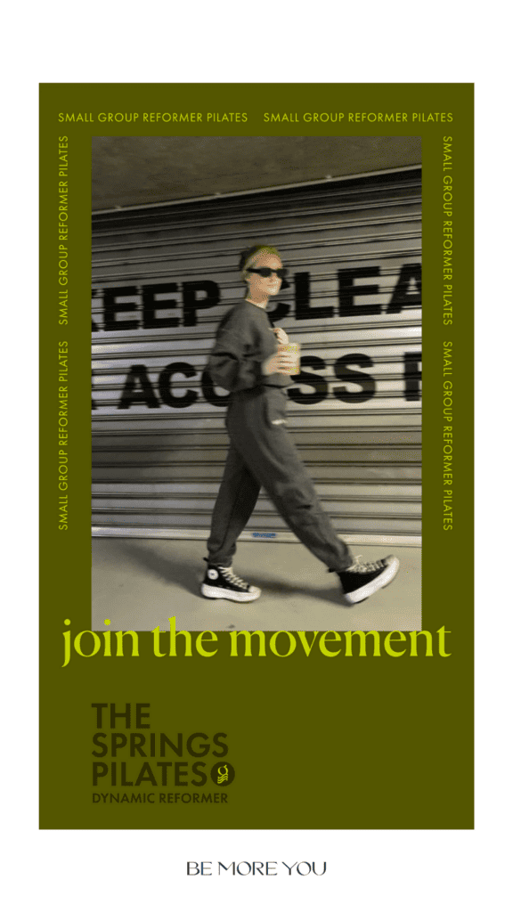
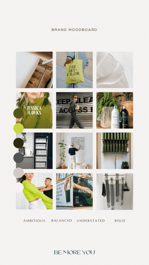
Reformer Pilates has become an exercise class for the Instagram era and the brand aesthetic needed to appeal to a wide audience. Ultimately, we wanted the brand to feel dynamic and edgy, but we steered away from skinny models in cropped tops because we wanted the brand to feel inclusive and accessible to all body shapes.
Design Inspiration: The Springs
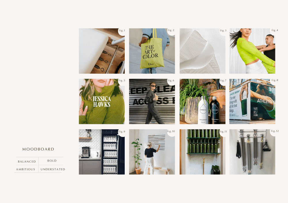
The design inspiration for The Springs is luxury wellness meets athleisure fashion. We steered clear of the obvious pinks and blacks you normally find in the pilates world and leaned more towards luxury spa aesthetic. We kept the design minimal and gender-neutral.
We also steered away from the Eastern symbolism often found in yoga and pilates spaces because, well, appropriation isn’t cool.
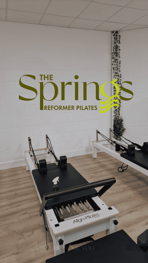
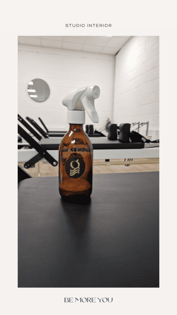
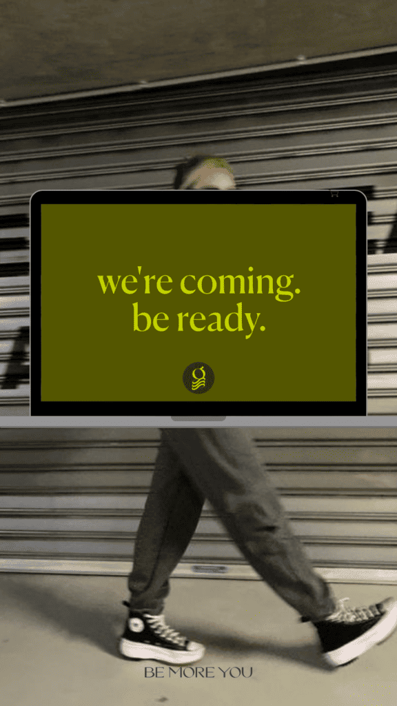
The custom logo incorporates a subtle spring design element as a nod to the springs of the reformer. This element became the brand mark and is used in the favicon. It’s also been used across different areas across the business from social media posts, window wraps and even on the organic cleaning bottles.
Brand Design: The Springs
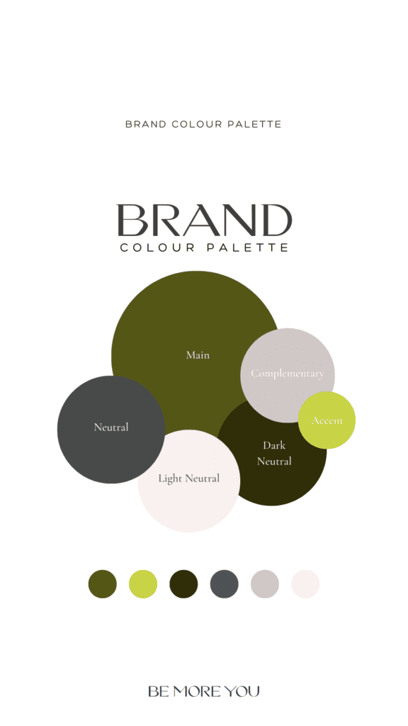
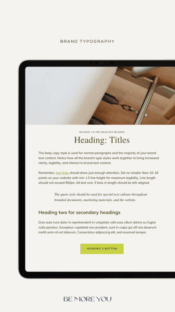
Modern, minimal and bold, the olive and neon green colour palette mixes laid-back cool with a burst of energy. The brand typography pairs a timeless serif font with an understated weighty serif font.
Website Design: The Springs
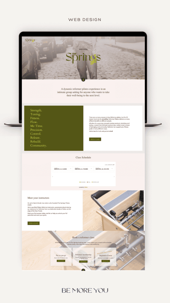
We built a one-page WordPress website with online booking functionality for clients to book classes online. The weekly schedule is also embedded so that clients can view times and availability before booking.
Check out their website at thespringsstudio.com.
Ready to Uplevel your brand?
A strong brand can elevate your business, amplify your message and create a lasting impact. If you’re ready to step into the next level for your brand schedule a discovery call with me.

