TV nutritionist Yvonne Bishop Weston approached me to rebrand her successful nutritionist practice in lockdown when she had to move her Harley Street nutrition clinic back to her New Forest clinic.
Yvonne is a well-respected nutritionist with over 20 years of experience serving high-profile clients worldwide from her Harley Street clinic. But her visual brand and online presence didn’t match her expertise and with her client base moving online through the pandemic, she wanted to uplevel her brand.
Yvonne and her award-winning chef husband Tony have co-authored multiple cookbooks and worked as corporate food consultants to some of the biggest-name corporate clients in the UK. Over the years their business structure has become complex and they wanted to merge the different businesses under one name – Yvonne Bishop Weston Nutrition.
Brand Strategy
Going into this project, my goal was to create something that reflected Yvonne and Tony’s expertise, experience and credibility and to give them a unique brand identity that aligns with who they are.
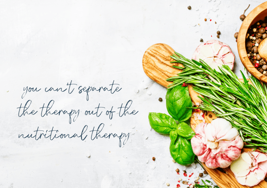
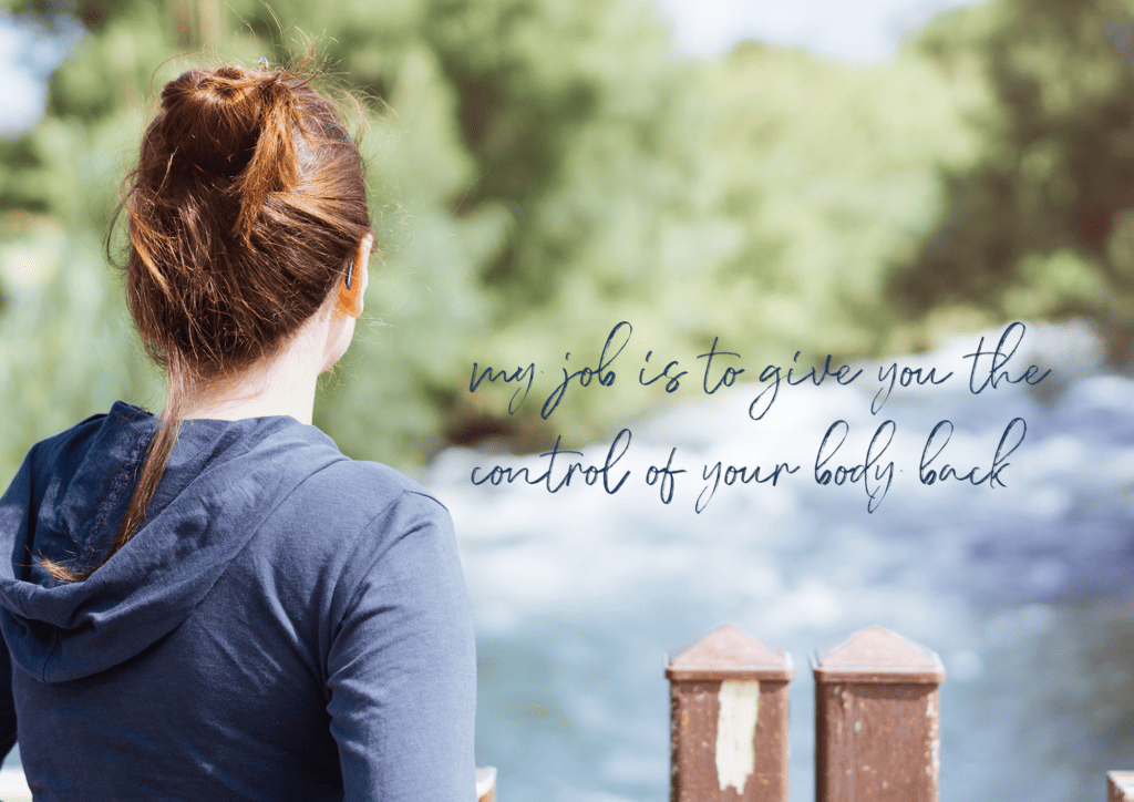
Many of Yvonne’s clients are used to seeing her on TV on the BBC’s truth or scare or in her Harley Street clinic setting, but I wanted them to see more of Yvonne in her home setting, surrounded by gorgeous feasts of homemade food and her overflowing kitchen garden.
I wanted the brand to exude the warmth and passion of Yvonne and Tony. I also wanted the brand to feel more familiar for their New Forest-based clients, elevated without feeling austere.
More than anything, I wanted to create a brand that lends itself to community with a feeling of accessibility.
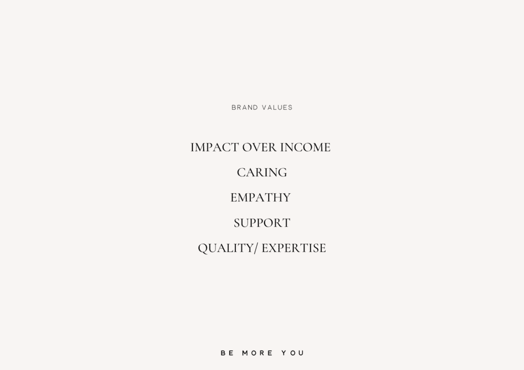
Yvonne & Tony have dedicated their lives to creating a positive impact through sharing their love of food and they continue to empower and inspire through their books, TV appearances and forest-based clinic. So it was important to ensure that the brand conveyed a celebration of food, rather than compounding misconceptions that visiting a nutritionist would lead to a restricting diet.
The Brand Concept
Yvonne was introduced to me by my past-client Laura Green, of Laura Green Yoga. Laura described Yvonne as “brilliant”, “one of the best in the business”. She then told me a story of how Yvonne had helped a friend of hers who had been struggling to get pregnant and who’d had no luck with IVF.
Yvonne had ‘prescribed’ an abundance of organic vegetables to be eaten every day, requiring multiple trips to several organic farm shops to purchase the wide variety of vegetables needed. It was hard, but it worked and the friend is now a proud mum.
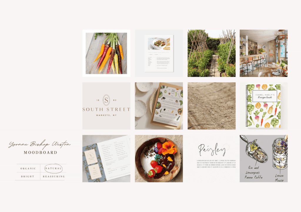
This story became the basis for the brand: – an abundant, colourful feast for the eyes.
Nutritionist Brand Design
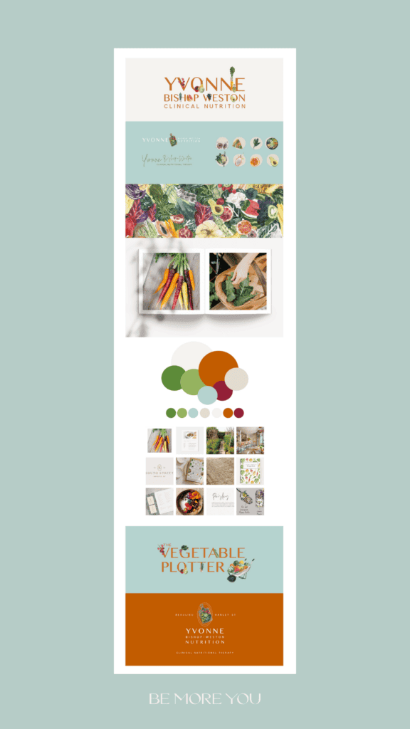
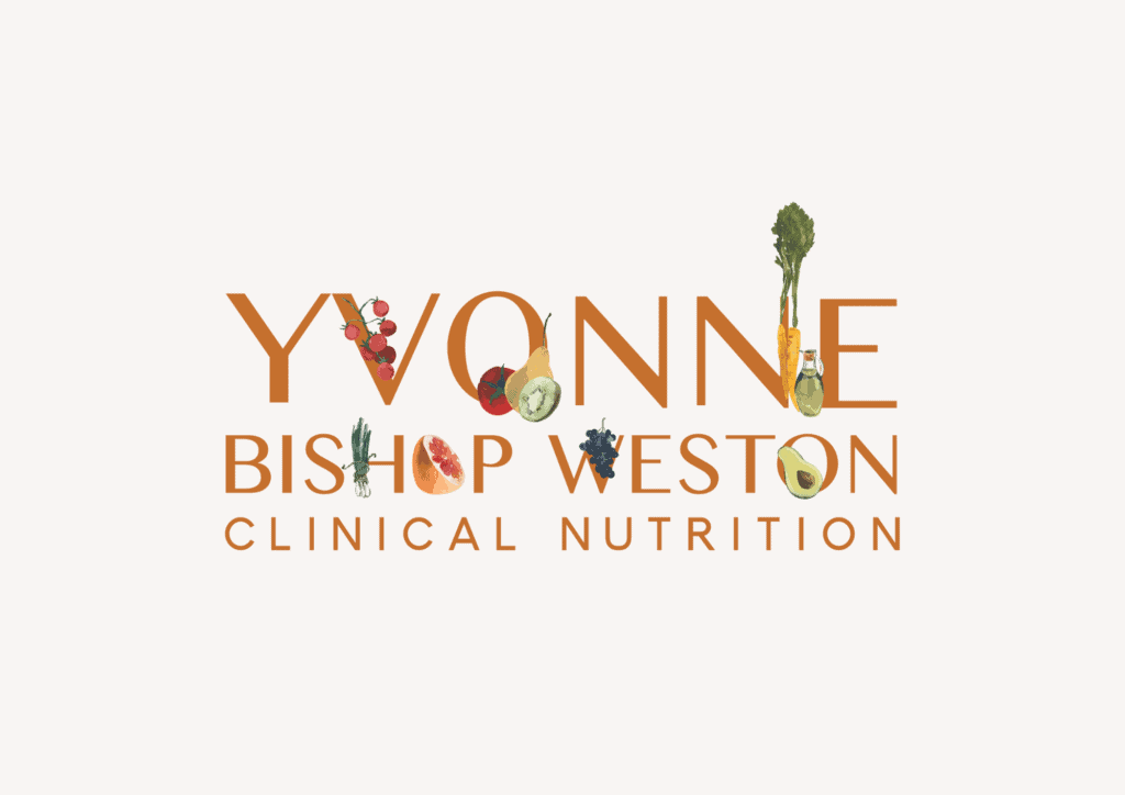
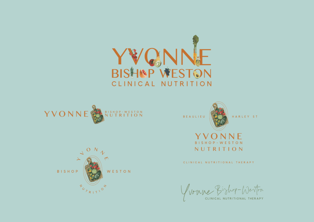
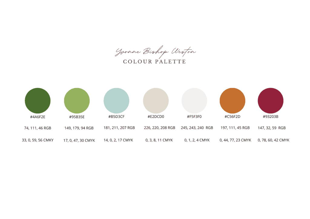
Yvonne’s main logo features watercolour fruit and veg illustrations inspired by the illustrated recipes in the Great British Bake-off. In colour psychology, orange is used in culinary settings to promote appetite, we opted for a burnt orange in autumnal tones that evoke plentiful harvest vibes and paired it with leafy greens, mushroom grey and coconut white with a pop of sky blue and beetroot red.
Website Design
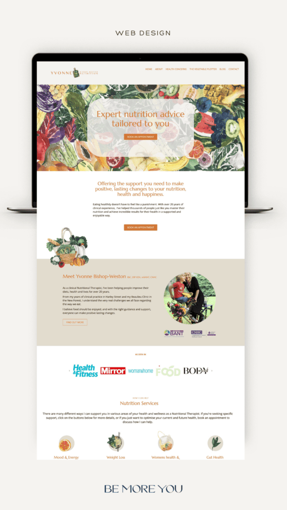
Built on WordPress, Yvonne’s website combined all of her previous websites in one place. The individual Health concern pages contain helpful information describing how nutrition can be a useful part of the health puzzle.
Yvonne has appeared extensively in the press and media, so I added a scrolling band of logos which serve as social proof of her authority. There’s also a clickable library of her media articles.
Clients can now book and pay for their sessions using an online booking system.
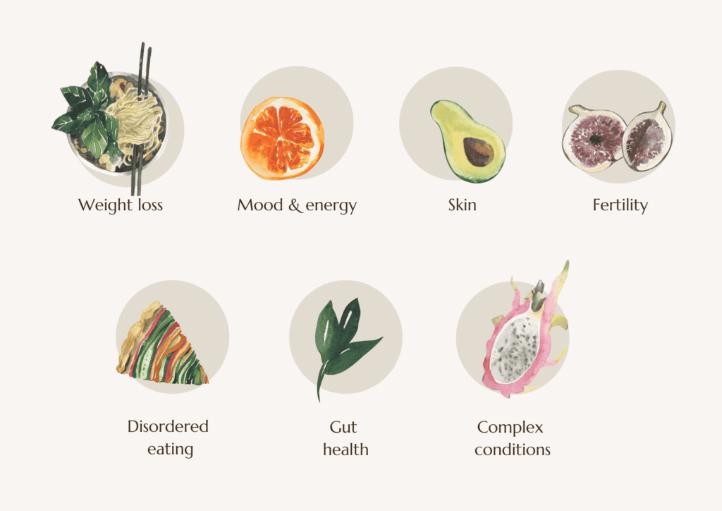
We opted for food illustration imagery instead of generic stock photography to differentiate Yvonne’s website from the competition. The imagery creates a seamless journey across the website and is also used in Yvonne’s client handouts for consistency.
Visit the website here: Yvonnebishopweston.co.uk
Conveying complex information using design
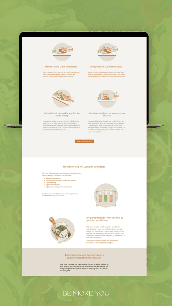
Yvonne wanted her website to be a helpful resource for people seeking expert nutrition advice, so I was challenged with conveying complex information in an accessible way.
I created these bespoke illustrations of an overloaded cargo ship to explain how environmental, genetic, lifestyle and dietary factors can all add up to create chronic health conditions in the body.
We kept the paragraphs short and the information ‘bite-size’ to make it easier for people to read and consume without overwhelming them, in much the same way Yvonne works with her clients.
Combining businesses with sub-brands
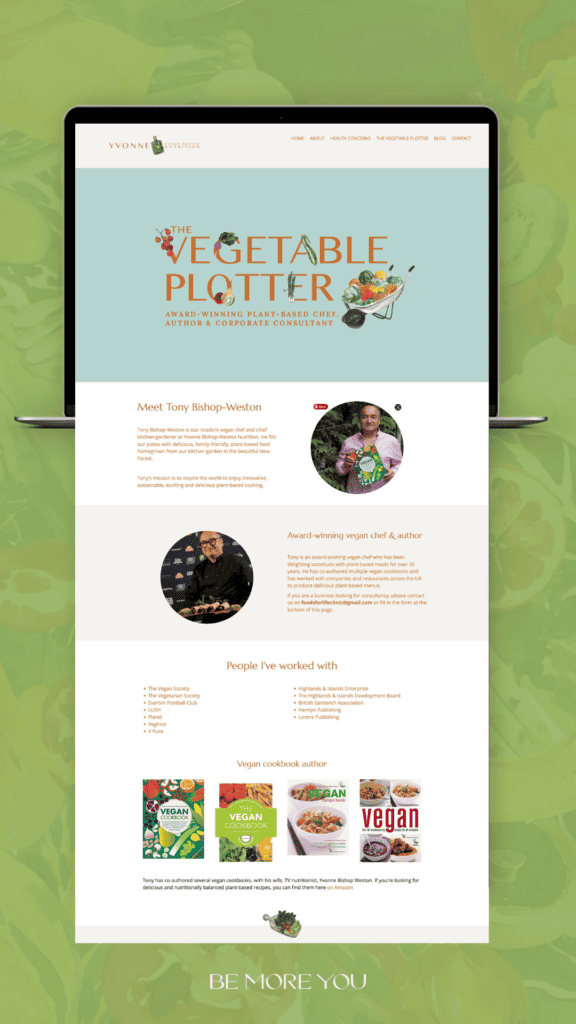
Tony and Yvonne have worked together as co-authors and as consultants for years. Tony wanted a space to showcase his work without needing a separate website, so we created “The Vegetable Plotter” section on the website, where Tony can share his Recipes and enthuse and inspire people with his love of vegan cooking from his kitchen garden.
Ready to Uplevel your brand?
I hope you’ve enjoyed peeking behind the curtains of this gorgeous brand creation. A strong brand can elevate your business, amplify your message and create a lasting impact. If you’re ready to step into the next level for your brand schedule a discovery call with me.

