Unlock the Power of Colour Psychology in Branding: Master the Art of Emotional Connection
Share this post


BE MORE YOU | BRAND STRATEGIST, DESIGNER & SEO EXPERT
Colour psychology in branding studies how colours influence perceptions and behaviours, particularly in relation to brands and marketing. Colour meanings are deeply ingrained in our experiences. Different colours evoke different emotions and associations, making them powerful tools in branding and design.
In branding, colour psychology is about choosing colours that align with a brand’s identity, values, and the message it wants to convey. It’s not just about aesthetics; it’s about creating a visual language that communicates with the target audience on a subconscious level. The right colour choices can enhance brand recognition, influence consumer behaviour, and even impact a brand’s perceived value.
What Colours Mean What in Branding?
Colour psychology is not prescriptive, each colour in branding has a dual nature and the impact can be affected by your use of other colours and elements. While each colour can have positive connotations, overuse or misuse can lead to negative perceptions, highlighting the importance of context and balance in brand colour choices.
- Red: Positives – Energy, passion, urgency. Negatives – Aggression, danger.
- Blue: Positives – Trust, dependability, calm. Negatives – Coldness, detachment.
- Green: Positives – Growth, health, tranquility. Negatives – Envy, inexperience.
- Yellow: Positives – Optimism, youthfulness. Negatives – Irritation, caution.
- Purple: Positives – Luxury, sophistication. Negatives – Extravagance, moodiness.
- Orange: Positives – Creativity, energy. Negatives – Frivolity, immaturity.
- Black: Positives – Elegance, sophistication, formality. Negatives – Grief, mystery.
- White: Positives – Purity, simplicity. Negatives – Sterility, coldness.
- Teal: Positives – Calmness, clarity. Negatives – Emotional detachment, aloofness.
- Pink: Positives – Nurturing, romance. Negatives – Over-sensitivity, immaturity.
- Grey: Positives – Neutrality, sophistication. Negatives – Dullness, depression.
Colour Shade Psychology
The psychology of colour extends beyond just the basic hues to include the nuances of shade, tint, and saturation, each playing a pivotal role in the psychological impact of colour. Lighter shades, or tints, often feel softer and more approachable, whereas darker shades convey a sense of gravitas and depth. Saturation also affects emotional response; highly saturated colours are vibrant and energizing, while desaturated hues are perceived as more subdued and sophisticated.
Brand designers skillfully use these variations to their advantage, crafting balanced colour palettes that align with the brand’s desired emotional impact. By adjusting the shade and saturation, designers can fine-tune the message and tone of the brand, ensuring that the colours not only align with the brand identity but also evoke the right emotional response from the audience. This nuanced approach to colour psychology allows for a more sophisticated and targeted brand experience.
What Colours are Most Attractive for Branding?
The attractiveness of brand colours depends largely on the context and the target audience. Generally, bright and bold colours like red, blue, and yellow can be very eye-catching and are used to grab attention quickly, but they can be seen as generic, corporate or even childish in nature – think Haribo and Fireman Sam.
Cooler tones like blue and green are often seen as more professional and trustworthy, which is why corporate banks and financial institutions will often use blue in their branding.
Pastel colours have gained popularity for their soft and approachable look, especially in brands targeting younger or more fashion-forward audiences. Ultimately, the most attractive colour for a brand will align with its identity and resonate with its target audience.
How to Use Colour Psychology in Branding
Using colour psychology in branding effectively requires understanding the emotional impact of different colours and how they align with the brand’s personality. Start by defining the brand’s core values and the emotions you want to evoke in your audience. Then, choose colours that reflect these values and emotions. It’s important to consider cultural differences in colour perception and to test colour choices with your target audience.
It’s crucial for colour psychology to align with other brand elements like typography, design elements, brand personality, design aesthetic, and overall brand identity. This ensures a cohesive and effective brand message. The choice of colour should not only reflect the brand’s character but also resonate with the target audience, fitting seamlessly with the brand’s broader narrative and visual representation.
How to use colour to connect with your audience
Using colour effectively to connect with your audience in branding involves several key strategies:
- Understand Colour Associations: Different colours evoke different emotions and associations. For instance, blue often represents trust and reliability, while green is associated with growth and health. Choose colours that align with the emotions you want your brand to evoke.
- Know Your Audience: Different demographics and cultures may perceive colours differently. Research your target audience’s preferences and cultural associations with colours to ensure your choices resonate with them.
- Consistency Across Branding: Use your chosen colours consistently across all branding materials – from your logo and website to your packaging and marketing materials. This consistency helps build brand recognition and a stronger emotional connection.
- Balance with Design Elements: Combine colours with other design elements like typography and imagery to create a cohesive brand identity. The right combination can enhance the emotional impact of your branding.
- Leverage Colour Trends: Stay aware of current colour trends, but use them judiciously. While being trendy can appeal to certain audiences, it’s important that the colours still align with your brand identity.
- Test and Get Feedback: Before finalising your colour choices, test them with focus groups or surveys to see how they resonate with your audience. Feedback can provide invaluable insights into the emotional impact of your colours.
- Use Colour Psychology: Each colour has psychological attributes. For example, using red for a call-to-action button can create a sense of urgency, while using yellow can evoke a feeling of optimism and cheerfulness.
- Storytelling with Colours: Use colours to tell your brand’s story. The right colour palette can help convey your brand’s backstory, mission, and values without words.
By thoughtfully applying these strategies, colours can become a powerful tool to connect emotionally with your audience, enhancing brand recognition and loyalty.
Colours that Build Trust
Blue is famously effective in building trust, hence its widespread use in healthcare, finance, and technology sectors. Green, with its associations with health and serenity, also conveys trust, especially in brands related to wellness and nature. Neutral colours like grey and some shades of brown can also be seen as stable and reliable, suitable for brands that want to appear grounded and dependable.
Colours that Encourage Healing
Green, with its connections to nature, is known for its calming and healing properties. Light blues and soft earth tones are also associated with tranquillity and can promote a sense of peace and healing. These colours are often used in healthcare and wellness branding to create a sense of safety and comfort.
Green colour psychology in branding
Green is commonly used to promote health and healing due to its strong associations with nature, growth, and balance. Its effects on mood are significant and multifaceted:
- Connection to Nature: Green is the most prevalent color in nature. This connection promotes a sense of restfulness, growth, and renewal, which is inherently healing and restorative. Being surrounded by green, even in an indoor or artificial environment, can mimic the calming effects of being in nature.
- Promotes Relaxation: Green is a soothing color that can help reduce anxiety and promote a state of tranquility. It’s often used in environments such as hospitals, clinics, and wellness centers to create a calming atmosphere that aids in recovery and relaxation.
- Balance and Harmony: Green is considered a balanced and harmonious color, situated in the middle of the color spectrum. This balance is thought to bring equilibrium to the mind and body, encouraging a state of emotional well-being.
- Positive Emotional Impact: Exposure to green can have a positive effect on mood, fostering feelings of freshness, safety, and peace. It can uplift spirits and help alleviate stress, which is beneficial for both mental and physical health.
- Stimulates Healing: In color psychology, green is believed to promote healing and rejuvenation. It’s thought to enhance the body’s healing processes and is often used in therapy and healing practices.
The use of green in branding and spaces related to health and healing takes advantage of these associations and effects, creating environments that support wellbeing and convey a message of growth, health, and balance.
The calming effect of Light Blue
Light blue is often considered a healing colour due to its calming and soothing properties, and it has a significant impact on mood:
- Calming Effect: Light blue is associated with the sky and water, elements that are often perceived as calming and serene. This association helps to reduce stress and promote a peaceful state of mind, making it an ideal colour for relaxation and tranquillity.
- Promotes Mental Clarity: The clarity and purity of light blue can encourage mental focus and clear thinking. It’s often used in environments where concentration and calm decision-making are important.
- Inspires Trust and Safety: Light blue is also associated with trustworthiness and reliability. This can create a sense of security and safety, which is essential in healing environments.
- Reduces Fatigue and Anxiety: The soothing qualities of light blue can help alleviate feelings of anxiety and fatigue. This makes it a good choice for healthcare settings, where creating a restful and stress-free atmosphere can support healing.
- Encourages Communication: Light blue is often linked with communication and openness. This can foster an environment where thoughts and feelings are freely expressed, which is beneficial in therapeutic and healing contexts.
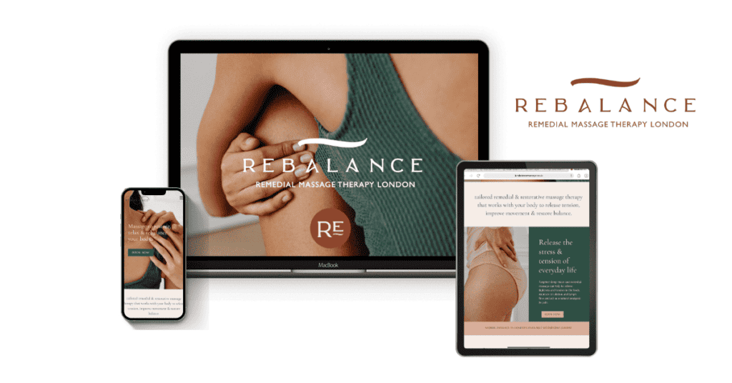
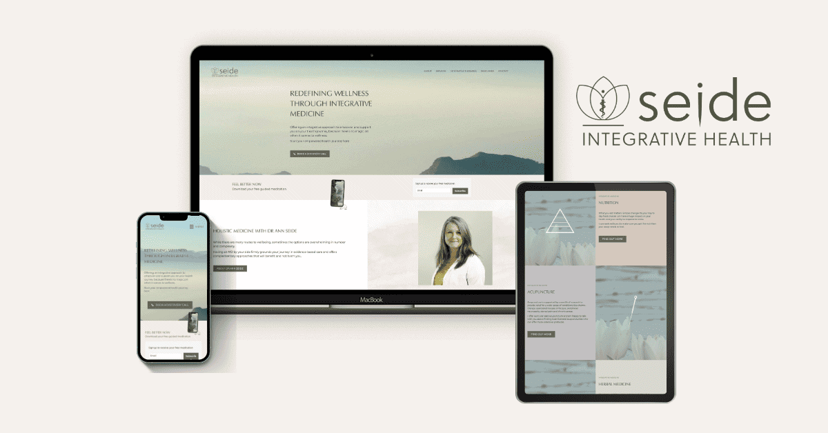
For the Seide Integrative Health brand, we combined shades of light blue, shades of lilac and soft natural tones and watercolour effects to provide a calm and soothing brand experience.
Overall, light blue’s influence on mood is predominantly positive, leaning towards creating a calming, serene, and trust-inspiring atmosphere. This makes it a popular choice in healthcare, wellness, and therapeutic settings, where these qualities can contribute to healing and overall well-being.
The soothing nature of Lilac
- Calm and Soothing Nature: Lilac has a calming and tranquil effect on the mind. Its soft and muted quality can help reduce stress and anxiety, promoting a sense of peace and relaxation. Its soft and muted tone is less intense than deeper purples, which makes it more peaceful and less stimulating.
- Uplifting and Spiritual: Lilac is also known for its uplifting qualities. It can evoke feelings of spirituality and introspection, fostering a deeper connection with one’s inner self. Historically, purple and its shades like lilac have been associated with spirituality and mindfulness. These associations contribute to its use as a symbol of peace, as spirituality is often linked with inner peace and harmony.
- Nurturing and Romantic: The gentle nature of lilac can evoke feelings of nurturing and romance, contributing to a sense of comfort and emotional well-being.
- Connection to Nature: Lilac is also a colour found in nature. Natural elements are commonly associated with peace and harmony. Often associated with spring and blooming flowers, It brings a sense of rejuvenation, freshness and renewal:
- Historical and Cultural Significance: In some cultures, lilac has been used in art and literature to represent peace, renewal, and purity. These historical and cultural associations strengthen its role as a peaceful colour.
Overall, lilac’s influence on mood tends to be positive, leaning towards calmness, creativity, and emotional upliftment. However, the effect can vary depending on individual associations and cultural contexts.
Brand Colours that say ‘Luxury’
Luxury brands often employ colours that exude depth, richness, and sophistication.
- Black is a prime example, signifying elegance and exclusivity, making it a popular choice in high-end branding.
- Purple, historically linked to royalty due to its rarity and cost, continues to represent luxury and opulence.
- Deep blues and rich reds also communicate sophistication and exclusivity.
- Metallic colours like gold, silver, and bronze are frequently used as accent colours, adding a layer of opulence.
Importantly, luxury brands tend to use a limited colour palette, often focusing on just one or two primary colours. This restraint in colour usage helps maintain a perception of exclusivity and quality, avoiding the impression of being overly flashy or cheap.
Why luxury brands favour Black
Black is often considered a luxury colour due to its association with sophistication, elegance, and exclusivity. Its effect on mood is influenced by these associations:
- Sophistication and Elegance: Black is synonymous with sophistication and elegance. It’s a colour often used in high fashion and luxury goods, contributing to its perception as a luxurious and upscale colour. This association can evoke feelings of refinement and prestige.
- Exclusivity and Power: Black often represents power, authority, and exclusivity. It can create a sense of mystique and allure, often appealing to those who appreciate understated luxury. This can instil feelings of confidence and empowerment.
- Simplicity and Timelessness: Black is also valued for its simplicity and timelessness. In design, it can create a bold statement without the need for complexity, appealing to minimalist aesthetics. This simplicity can evoke feelings of clarity and focus.
- Seriousness and Formality: Black is often associated with seriousness and formality. This can impact mood by inducing a sense of solemnity and depth, making it a popular choice for formal occasions and high-end products.
- Contrast and Drama: Black creates a strong contrast, especially when paired with lighter colours. This can add a dramatic flair to design, impacting mood by making the environment or product feel more dynamic and engaging.
While black is often associated with luxury and sophistication, it’s important to note that its effect on mood can vary based on cultural contexts and individual experiences. In some contexts, black may also evoke negative emotions such as sadness or heaviness, so its use in branding and design must be balanced and contextually appropriate.
Royal Purple psychology
Historically, purple was an expensive colour to produce due to the labour-intensive and resource-heavy process required to extract the dye. The most famous purple, Tyrian purple, originated from the city of Tyre in ancient Phoenicia (modern-day Lebanon). This dye was made from the secretions of the Murex sea snail.
The Murex snails required for Tyrian purple were relatively rare and found only in certain parts of the Mediterranean Sea. It took thousands of these snails to produce just a gram of the purple dye in a complicated and time-consuming extraction process.
The resulting Tyrian purple dye was exceptionally long-lasting and did not fade easily, unlike many other dyes. This durability added to its value and desirability.
Because of this, purple dye became a symbol of wealth, power, and royalty. Only the wealthiest could afford to wear garments dyed with Tyrian purple, reinforcing the colour’s association with luxury and exclusivity, an association that lives on today in brand colour psychology.

Blue: The World’s favourite colour
The world’s favourite colour, as per various surveys and polls, has often been identified as blue. Blue is widely appreciated for its versatility and the positive emotions it evokes.
Sky and ocean blue hues symbolize freedom, openness, and tranquility. Blue also tends to have a universal appeal across different cultures and demographics, further solidifying its position as a globally favoured colour.
Why is Blue used for communication brands?
Blue is a popular colour choice for communication brands for several reasons:
- Trust and Reliability: Blue is widely perceived as a stable and trustworthy colour, which is crucial for brands in the communication sector where trust and reliability are key.
- Calm and Clarity: Blue also conveys a sense of calm and clarity, qualities that are desirable in communication where clear, unambiguous messaging is important.
- Professionalism: It’s a colour that’s often associated with professionalism and efficiency, aligning well with the corporate and business-oriented nature of many communication brands.
- Universally Appealing: Blue is generally well-received across different cultures and demographics, making it a safe and appealing choice for global brands.
These attributes make blue a fitting choice for communication brands, helping them to project an image of reliability, clarity, and professionalism.
Stand out psychology: The colour we always see first
Red is the colour that draws our attention more than any other. It is the most visually arresting colour, often associated with urgency, excitement, and importance. Humans have evolved to be particularly sensitive to the colour red, likely due to its importance in natural settings (such as signalling ripe fruit or danger).
Its ability to stand out makes it a frequent choice for warnings, stop signs, and call-to-action buttons. Red’s high visibility is why it’s used to capture attention and convey critical messages quickly.
Brands that should use red are those looking to convey energy, passion, excitement, or urgency. It’s ideal for brands in the food industry, as red is known to stimulate appetite. Sports brands and those in the entertainment sector also benefit from red’s dynamic and energetic associations.
However, brands promoting relaxation, tranquillity, or luxury might avoid red, as it can be too stimulating and intense. It’s also less suitable for businesses that want to convey a sense of calmness, stability, or environmental consciousness.
Colour Psychology according to the Chakras
The chakras, according to traditional Indian belief and yoga philosophy, are seven main energy centers located along the spine. Each chakra’s colour and meaning are said to correspond to specific physical, emotional, and spiritual states. In practices like yoga and meditation, focusing on these chakras and their colours is believed to help balance and enhance the flow of energy throughout the body.
Each chakra is associated with a specific colour and has its own distinct meaning:
- Root Chakra (Muladhara):
- Colour: Red
- Meaning: Represents stability, grounding, physical energy, will, security.
- Sacral Chakra (Svadhisthana):
- Colour: Orange
- Meaning: Associated with creativity, sexuality, emotion, and pleasure.
- Solar Plexus Chakra (Manipura):
- Colour: Yellow
- Meaning: Tied to personal power, self-esteem, and self-confidence.
- Heart Chakra (Anahata):
- Colour: Green
- Meaning: Related to love, compassion, acceptance, and trust.
- Throat Chakra (Vishuddha):
- Colour: Blue
- Meaning: Linked to communication, self-expression, and truth.
- Third Eye Chakra (Ajna):
- Colour: Indigo
- Meaning: Associated with intuition, insight, and mental clarity.
- Crown Chakra (Sahasrara):
- Colour: Violet or White
- Meaning: Represents spiritual connection, enlightenment, and consciousness.
Using Colour Psychology as a Spiritual Business
Spiritual brands can use chakra colours in their branding effectively by aligning these colours with the values and messages they wish to convey. Here’s how they can do this:
- Identifying Brand Values with Chakra Meanings: Each chakra colour represents specific qualities (like stability, creativity, love, etc.). Brands can choose colours that align with their core values or the aspects of spirituality they focus on. For example, a brand focusing on love and compassion might emphasize the green of the Heart Chakra.
- Target Audience Alignment: Understanding the target audience’s spiritual beliefs and practices can guide which chakra colours to emphasize. For instance, if the audience resonates more with themes of enlightenment and consciousness, the violet or white of the Crown Chakra might be more appropriate.
- Creating a Balanced and Harmonious Design: Using a palette that includes several chakra colours can create a sense of balance and harmony, reflecting the holistic nature of spirituality. This approach can be visually appealing and also convey a message of inclusivity and diversity in spiritual practices.
- Product Line Categorisation: Different chakra colours can be used to categorise products or services based on the aspects of wellbeing they address. For example, products focused on grounding and stability might use the red of the Root Chakra in their packaging.
- Marketing and Communication: In storytelling, marketing materials, and online presence, these colours can be used to quickly communicate the brand’s purpose and values. For instance, using blue in social media posts when talking about communication and self-expression can subtly reinforce the message.
- Interior Design and Aesthetics: For physical spaces like yoga studios or spiritual centers, chakra colours can be used in the interior design to create an environment that supports the intended spiritual practice.
By thoughtfully incorporating chakra colours into their branding, spiritual brands can create a deeper connection with their audience, convey their messages more effectively, and enhance the overall brand experience.
Picking a Meaningful Brand Colour Palette
Selecting a meaningful brand colour palette is a nuanced process that involves more than aesthetic appeal; it’s about crafting a story and forging an emotional connection. Begin by identifying the brand’s core values and personality traits. Choose primary colours that represent these traits, then select complementary colours to create balance and harmony. Adjusting the saturation, tint, or shade of these colours is crucial to achieving the desired emotional impact and brand balance.
Consider whether a monochromatic, high-contrast, or complementary seasonal colour palette best suits the brand’s identity.
- Monochromatic palettes, using varying shades of a single colour, can create a cohesive and sophisticated look.
- High-contrast palettes, in contrast, are more dynamic and eye-catching, ideal for brands wanting to make a bold statement.
- Seasonal colour palettes integrate colour psychology with the characteristics of the four seasons: Spring, Summer, Autumn, and Winter. Each season embodies distinct personalities and characteristics, which can be harnessed to create a brand identity that resonates with its target audience.
Test your colour palette in various applications to ensure it resonates with your target audience and functions well across different mediums – make sure you use a contrast checker for online use.
The right colour palette should not only be visually appealing but also reinforce the brand’s message and values, creating a distinctive and memorable brand identity.
Seasonal Colour Theory for Brands
Seasonal Colour Theory, is a transformative approach to branding that integrates colour psychology with the characteristics of the four seasons: Spring, Summer, Autumn, and Winter. Each season embodies distinct personalities and characteristics, which can be harnessed to create a brand identity that resonates with its target audience.
- Spring Personality: Spring colours are often light, bright, and clear, reflecting a sense of freshness, creativity, and new beginnings. These colours are ideal for innovative, vibrant, and dynamic brands.
- Summer Personality: Summer colours tend to be soft, muted, and pastel. They convey a sense of elegance, refinement, and calmness. Brands that wish to project sophistication and a classic style often use these colours.
- Autumn Personality: Autumn colours are rich, earthy, and warm, giving a sense of reliability and abundance. These colours are perfect for brands that want to be seen as trustworthy, grounded, and rich in tradition or heritage.
- Winter Personality: Winter colours are bold, strong, and clear, often featuring high contrast and luxurious hues. These are suitable for brands that aim to project a sense of luxury, precision, and exclusivity.
Incorporating Seasonal Colour Theory into brand design involves more than just selecting the right colours. It’s about creating a cohesive narrative through the use of colours, textures, type, patterns, and imagery that align with the seasonal personality the brand embodies. This approach ensures that the brand communicates its unique story and connects emotionally with its audience, compelling them to engage and buy.
This comprehensive understanding of colour psychology and seasonal personalities enables brand designers to create more resonant and effective brand identities, ensuring that every element of the brand’s design aligns with its core values and desired market position.
Avoiding Brand Colour Clichés
Avoiding colour clichés in branding is key to standing out while still appealing to your target audience. Common clichés include using pink for female-focused brands or green for eco-friendly products. To break free from these stereotypes:
- Understand Your Audience: Dive deep into your audience’s preferences and lifestyle. This understanding can reveal unconventional colour choices that resonate with them.
- Experiment with Palettes: Try unique colour combinations or unexpected shades within a typical palette. For instance, instead of standard pink for a female-focused brand, consider a bold magenta or a soft peach.
- Blend with Brand Personality: Align colours with the brand’s personality rather than industry norms. If your brand is playful or edgy, incorporate vibrant or unconventional colours.
- Use Colours Strategically: Utilise colour to highlight key messaging or products, drawing attention and creating a memorable brand experience.
- Stay Consistent Yet Flexible: Consistency in colour usage establishes brand recognition, but flexibility allows adaptation to different contexts or trends without losing identity.
By thoughtfully choosing colours, brands can create a distinctive identity that appeals to their audience while differentiating themselves from competitors.
Conclusion
In conclusion, colour psychology in branding is a profound and nuanced tool that transcends mere aesthetic choices, deeply influencing how audiences perceive and connect with your brand.
It’s about selecting and implementing colours that not only appeal to the eye but resonate with the emotions and values of your audience. Understanding and applying the principles of colour psychology can significantly elevate a brand’s identity, making it not just seen, but felt.
If you’re looking to create a brand identity that truly stands out, I invite you to work with me. Together, we can craft a unique and authentic brand presence, optimizing every element of colour and design psychology to ensure your brand not only resonates with your audience but also aligns seamlessly with your vision and values. Let’s embark on this creative journey to bring your brand’s story to life in the most vibrant and impactful way possible.
Share this post


